The Blog

|
I was directed to create 3 logos and create a brand. Some tools I used were the shape tools, pen tool, and the corner adjustments for shapes, and compound shapes. I created three brands for electronics. It was frustrating to create the logo so that it looked realistic and center align the laptop shape into the circle. I overcame it by looking at real images and grouping the laptop and center aligning them. 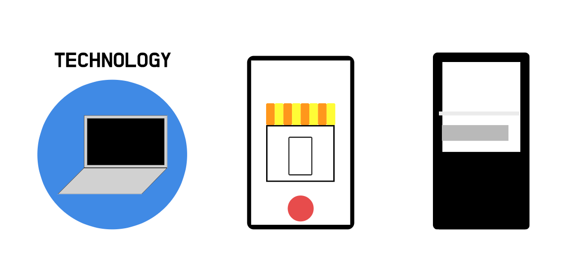 My first logo is the favorite because it looks the most simple. It will be called simple technology and it is a brand that sells tech. The brand is to sell technology to people in a very simple manner without signing a lot of contracts on payment. It will be pay once and use forever. The logo represents the brand because it is a very simple logo, which makes it go well with the whole concept. Lastly, the process making this that was the most important was showing the most information without making it look messy. 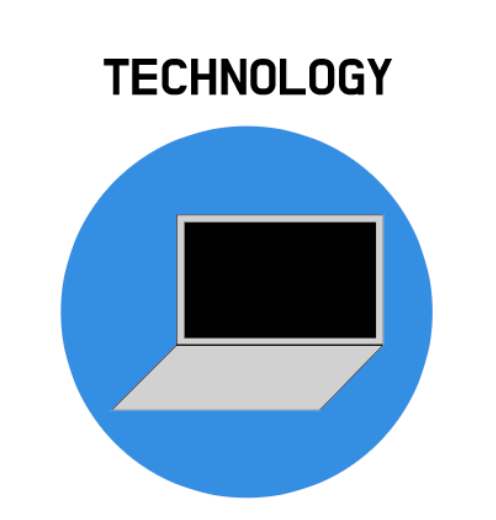
0 Comments
There are two artworks I had to create during the color theory unit. The assignments were color names and color schemes. In the color names assignment, I was asked to create an artwork that has at least 15 different colors. After that, I had to label the colors with both HEX and RGB. Therefore, I created 16 circles aligned equally and colored them in different colors and labeling. In the color schemes assignment, I used adobe color to create 5 different color schemes to show in the artwork. Through this activity, I created an artwork of a shirt and made aligned it, and colored it by the color schemes. Color names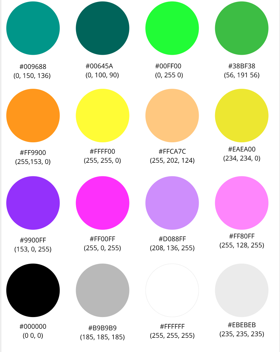 color Schemes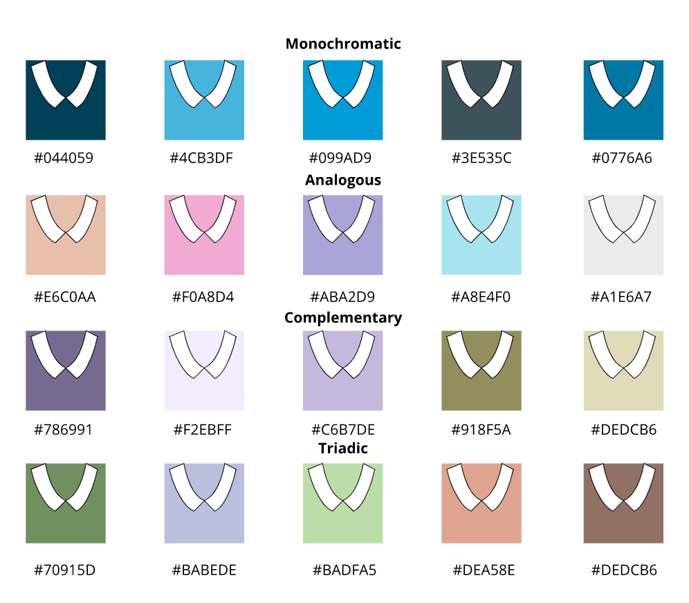 Typography is the visual part of a written texts or words. Typography is very important because it helps communicate the meaning and style better. The quote “Each font has a personality and a purpose,” means that every font is used in different situations to deliver the message in a better way. Although there are many fonts they can be classified to 5 types. These types are serif, sans serif, mono, display, and handwritten. Serif fonts have feet, sans serif don't have fee, mono have equal distances between fonts, display fonts are fancy fonts for displaying purposes and handwritten are handwritten like fonts. Serif fonts are used in large texts, sans serif would be used on the web, monospaced would be used for coding, handwritten would be used for calligraphy, and display are used to grab attention like on book covers or posters. TYpeface ComparisonIn this activity, I had to choose a text to write 5 types but with different types of fonts every time. I had to design the elements using the C.R.A.P design elements. 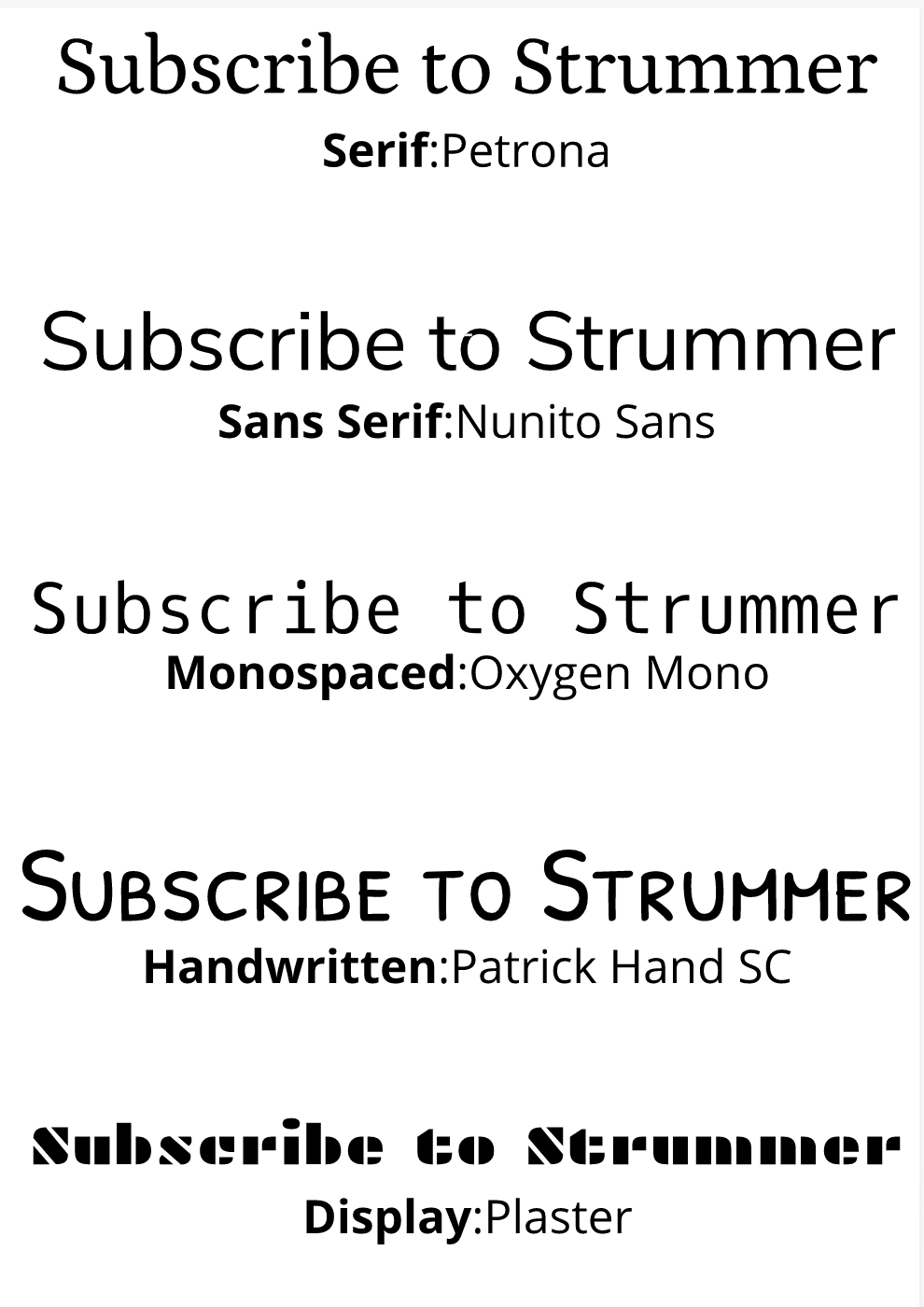 Word portraitsIn the word portrait activity, I used different fonts and wrote two words each in the font to show the difference in how some fonts fit well with certain words and some don't. 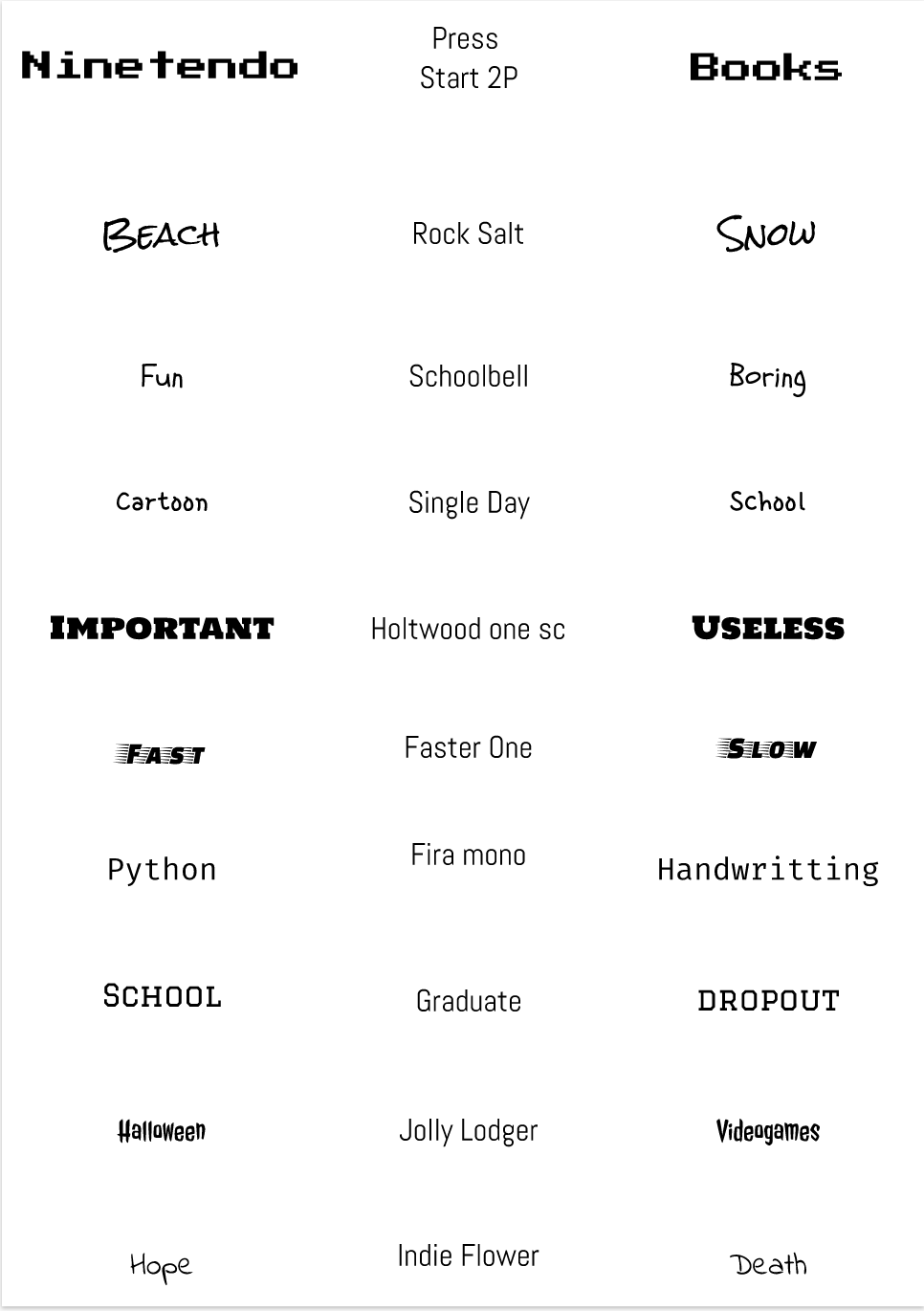 During tech class I did three different exercise that helped me enhance my ability to use the pen tool. The first assignment was tracing images through the guided lines, and the 2nd one was cropping an image without any lines to help me. The last assignment was cropping the images using the pen tool and combining them with other images. The pen tool is a tool that can be used like a pen to create shapes but by connecting points. The final project/assignment was created to show a photo of a classroom with a few of my friends and the elements representing some of my friends. The friends represented here are Nathan Choi as Naruto, Justin Chun as the mushroom from Mario, Andy Lim as OKC Thunder Logo, and Sky Joo as a Giraffe. It was pretty hard understanding how the alt/option key changed the direction of the line but over time I was able to learn. 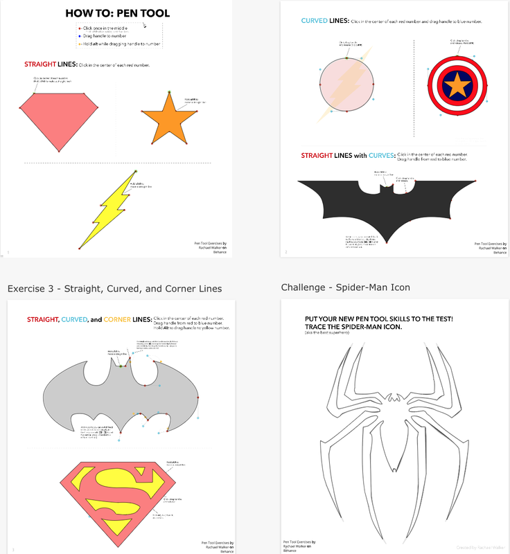 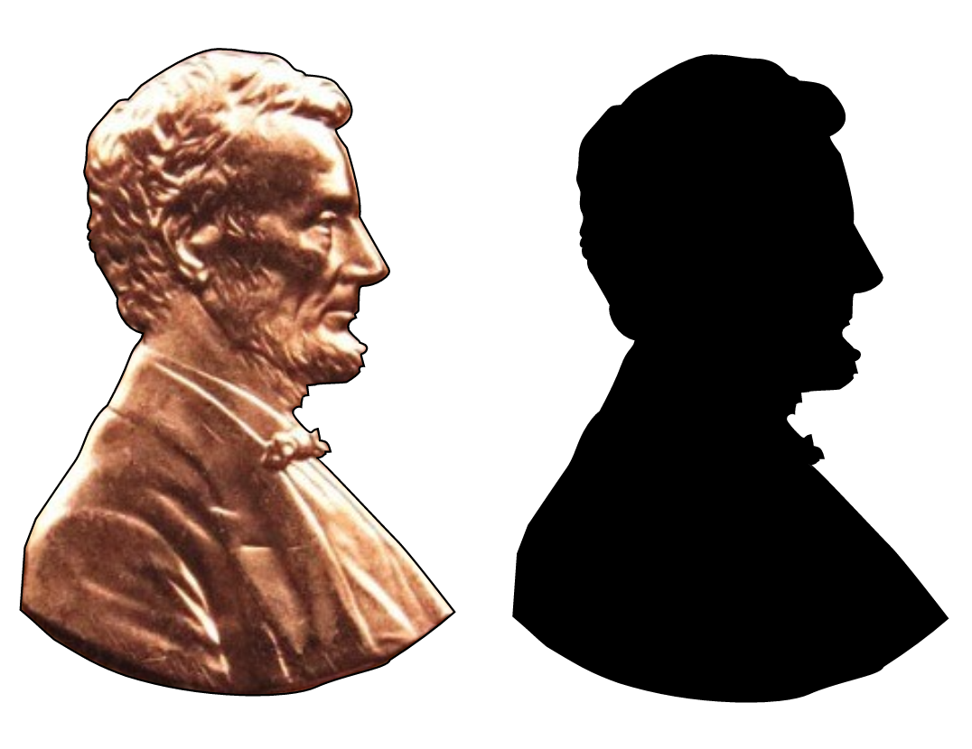 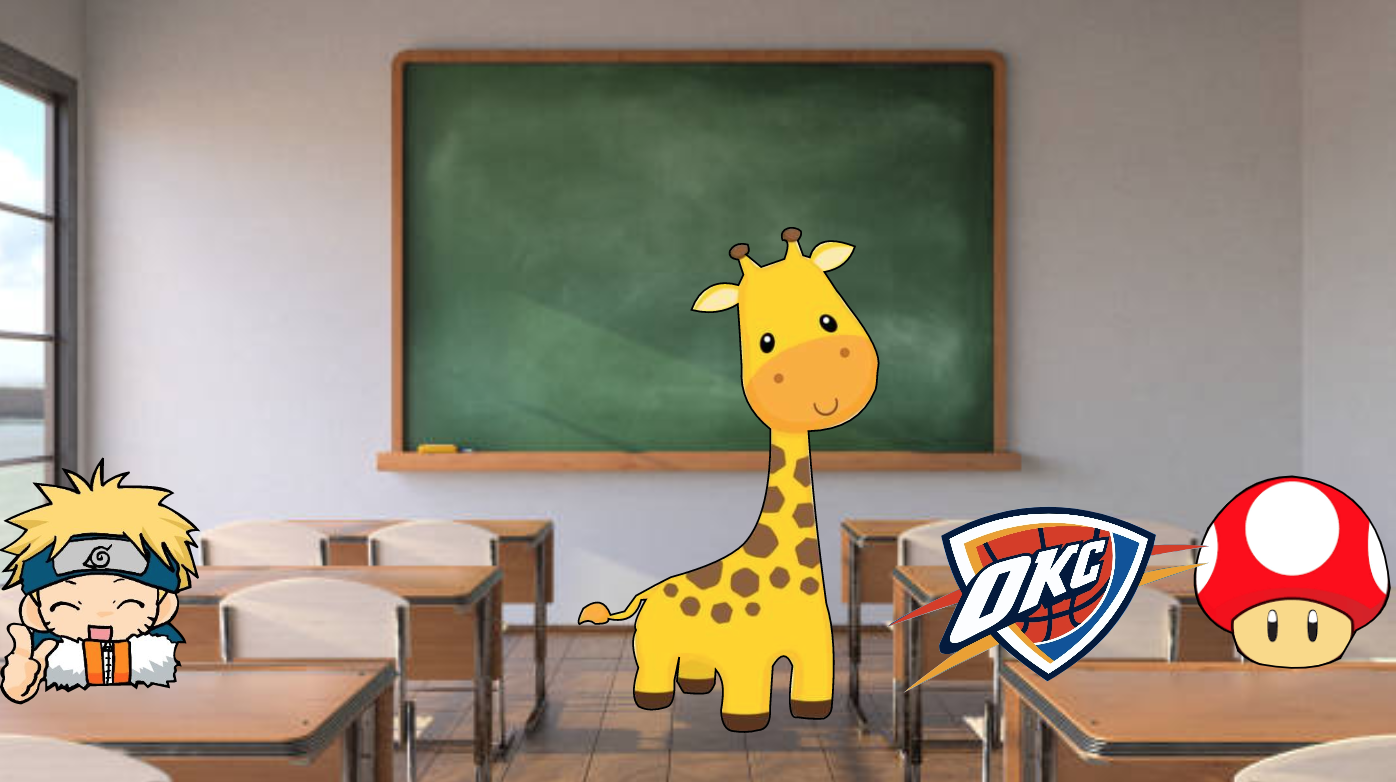 This illustration is very meaningful to me because playing video games is my hobby and I do that in my free time. The illustration shows me playing video games. There is a monitor, mouse, keyboard, mousepad, and headphone stand. 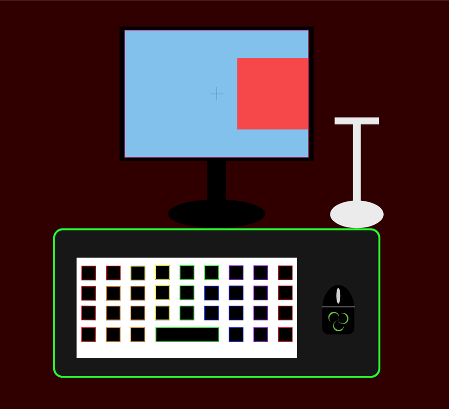 I learned how to make 2 shapes in union, subtract them, intersect them and see the difference. I also learned how to smoothen the ends of the shapes.  ..Today I learned how to align things. I learned how to evenly space things out both vertically and horizontally. I also learned how to group things using the shortcut. (Command+G). Lastly, I reviewed on how to copy items using the optioin key.  I learned what the option key does. I also learned how to move the boarder lines from the center to the sides. Lastly, I learned how to had dotted boarders. 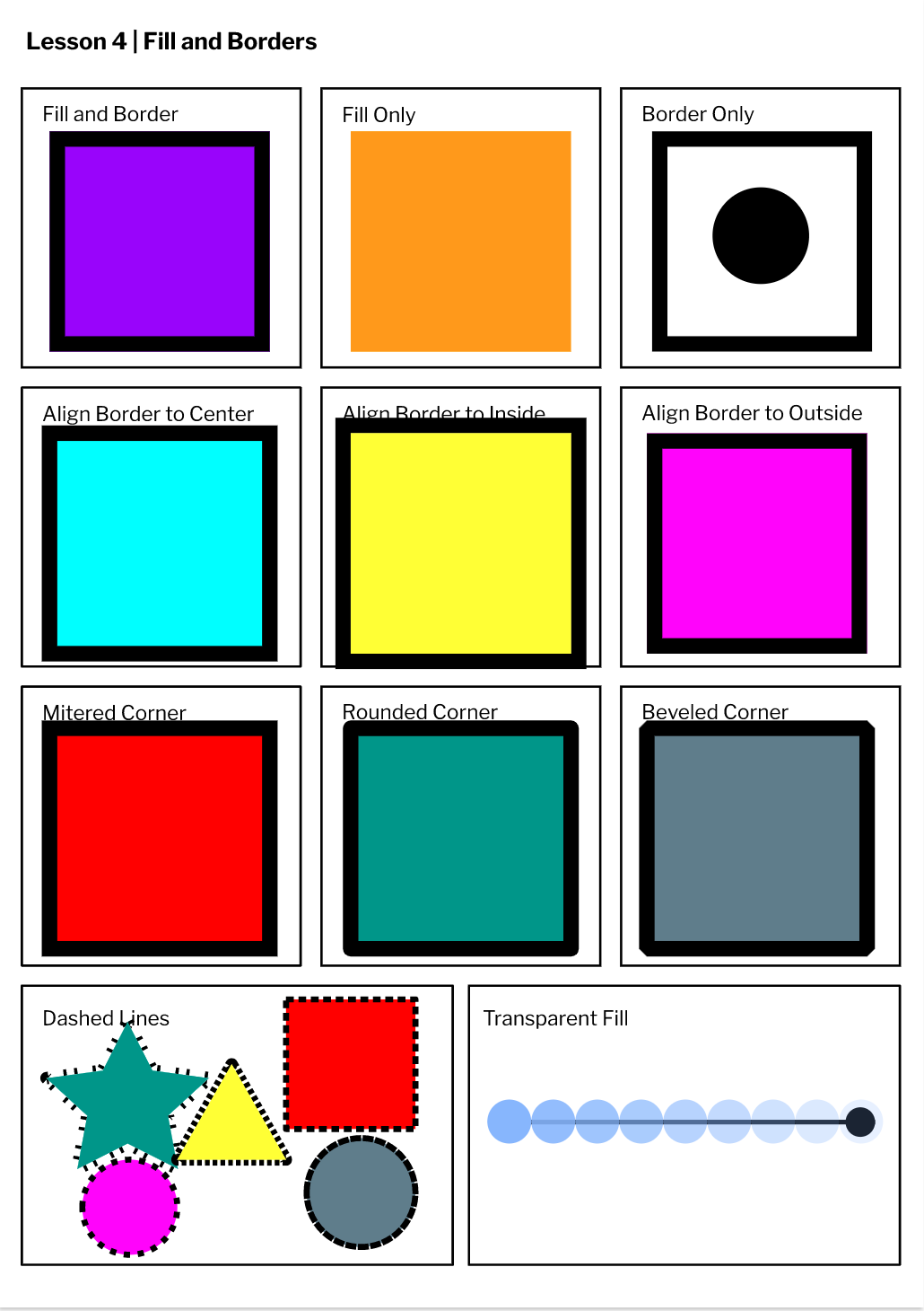 I learned how to use tools and how to create different shapes, move anchors and shortcuts. 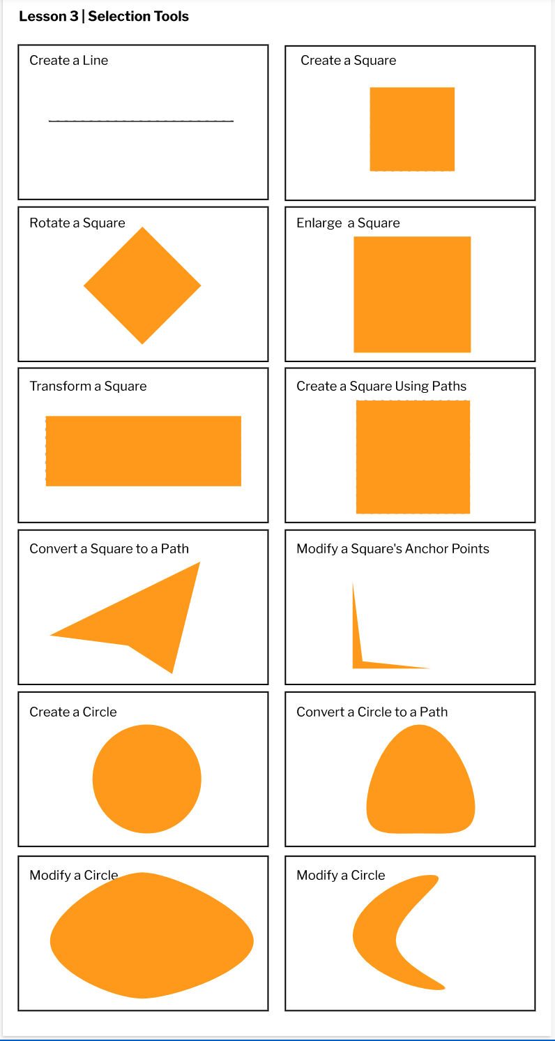 I learned how to use gravit and some basic keybinds to use. The software was interesting and I learned how to use different page sizes. 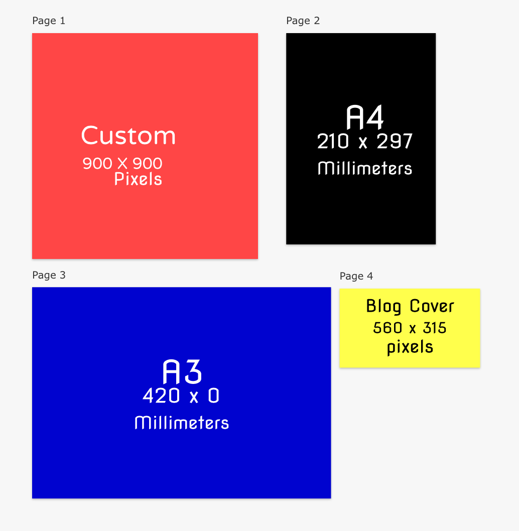 |
Archives
February 2021
Categories This work is licensed under a Creative Commons Attribution-NonCommercial-NoDerivatives 4.0 International License. |
