The Blog

|
I was directed to create 3 logos and create a brand. Some tools I used were the shape tools, pen tool, and the corner adjustments for shapes, and compound shapes. I created three brands for electronics. It was frustrating to create the logo so that it looked realistic and center align the laptop shape into the circle. I overcame it by looking at real images and grouping the laptop and center aligning them. 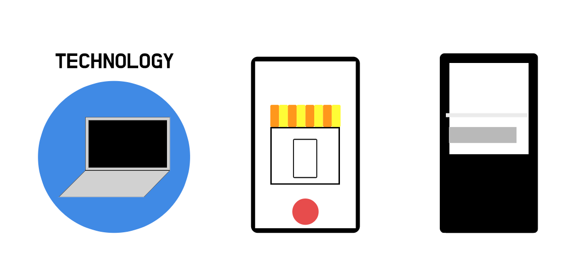 My first logo is the favorite because it looks the most simple. It will be called simple technology and it is a brand that sells tech. The brand is to sell technology to people in a very simple manner without signing a lot of contracts on payment. It will be pay once and use forever. The logo represents the brand because it is a very simple logo, which makes it go well with the whole concept. Lastly, the process making this that was the most important was showing the most information without making it look messy. 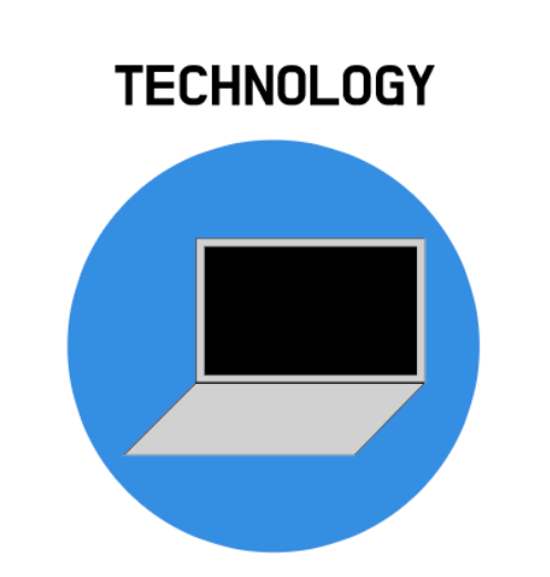
0 Comments
Leave a Reply. |
Archives
February 2021
Categories This work is licensed under a Creative Commons Attribution-NonCommercial-NoDerivatives 4.0 International License. |
